
Color Consultation Tips for Sarasota Homeowners
Color is more than just a beauty element in your home; it communicates mood, offers cues to architectural style, and even influences your everyday energy levels. Homeowners in Sarasota are increasingly recognizing that well-coordinated colors can transform spaces—from breathing new life into a tired bedroom to creating a fresh, welcoming kitchen ready for entertaining guests. A thoughtful coastal color palette can evoke a serene and inviting ambiance that echoes the natural shores and easy living of the region. Guided by the principles of color psychology and modern design trends, expert consultants help upscale homeowners translate coastal vibes into a refined coastal colorpalette that perfectly blends historic charm with modern appeal. Drawing on the innovations of 2025 color trends, these experts ensure every room resonates with a contemporary and sophisticated spirit. By embracing these strategies, residents not only enhance the aesthetics and overall comfort of their homes but also significantly boost their property value. This article delves into essential tips for color consultation—incorporating insights aligned with 2025 color trends—and real-world examples, to ensure your color choices harmonize with Sarasota’s unique climate and lifestyle while standing the test of time.
Key Takeaways
- Homeowners can leverage color psychology to create comfortable, mood-enhancing environments.
- Proper lighting assessment is crucial in selecting the right hues for every space.
- Cohesive color palettes throughout the home enhance aesthetic appeal and flow.
- Local natural elements and professional colorconsultation significantly elevate design outcomes.
Understand Color Psychology for Your Sarasota Home Design
Understanding the intrinsic power of color psychology is essential for transforming any interior space. The colors you select for your Sarasota home, for instance, by embracing a coastal colorpalette, can influence mood, stimulate conversation, and even affect work productivity. Scientific studies have shown that specific hues, often reflective of 2025 color trends, can reduce stress levels or enhance focus by triggering neurological responses. For instance, soft blues are often associated with calm and serenity, making them ideal for bedrooms and bathrooms, whereas energetic yellows can contribute to a cheerful atmosphere in kitchens or family rooms.
Learn How Colors Influence Mood and Ambiance in Your Spaces
Color creates an ambiance before a single piece of furniture is arranged. When homeowners choose a palette, such as a coastal colorpalette, for their living space, they often consider variables such as hue, saturation, and brightness to develop a setting that reinforces both functionality and aesthetics. Warm colors, such as reds and oranges, evoke feelings of passion and energy, which can be beneficial in social spaces like dining rooms. In contrast, cool colors like greens and blues enhance tranquility and relaxation—ideal for private retreats like bedrooms. This influence is not merely psychological; it also impacts physiological responses such as heart rate and blood pressure. As designers note, making conscious choices about color leads to environments that are not only beautiful but also supportive of well-being. The challenge for Sarasota homeowners is to find a balance that reflects their personality while remaining fresh and trendy in line with 2025 color trends.
Explore Color Meanings and Their Impact on Home Aesthetics
Apart from psychological effects, color has inherent meanings that interact with the overall style of the home. Historically, colors have been used symbolically to denote wealth, tradition, or modernity. For example, rich burgundy may evoke a sense of luxury and sophistication, which works well in formal living spaces. Conversely, pastel tones tend to suggest an airy, contemporary ambiance suitable for modern homes. When paired with textures, patterns, and finishes, these colors visually narrate a story of heritage and innovation. In Sarasota, where both historic and coastal influences reign, a coastal color palette helps in selecting the right color meaning to unify diverse architectural elements. Homeowners can achieve this unique blend through careful consideration of design history and current 2025 color trends recommended by leading decorators.
Identify the Best Colors for Sarasota’s Climate and Lifestyle
Sarasota’s warm climate and coastal geography call for a coastal colorpalette that not only remains timeless but also copes with intense sunlight and variable humidity levels. Light, breezy shades such as soft blues, sandy neutrals, and seafoam greens are popular because they mirror the natural landscape and help keep interiors cool in hot weather. At the same time, vibrant hues like coral or turquoise can evoke the region’s lively spirit without overwhelming the senses. When planning a color scheme inspired by 2025 color trends, it is also important to combine these climate-appropriate tones with the functionality of each room. For example, while the sun-drenched exterior may benefit from a high-gloss finish that repels heat, interior finishes might opt for matte textures to ensure a calmer, more subdued environment.
Consider Trends in Color Psychology for Local Homeowners
Local design trends in Sarasota increasingly reflect a fusion of modern minimalism and relaxed coastal charm. Many interior designers are now advocating for “calm and collected” palettes that combine neutral bases with vibrant accent colors inspired by nature. These trends are supported by market research and consumer behavior data indicating that homeowners are leaning toward a sophisticated palette that emphasizes natural elements. With emerging trends predicted for 2025—such as earthy tones, subdued metallics, and slightly desaturated pastels—homeowners are advised to future-proof their spaces. Designers often recommend using a dynamic mix of timeless colors combined with a few trendy accent colors to create environments that feel both current and enduring.
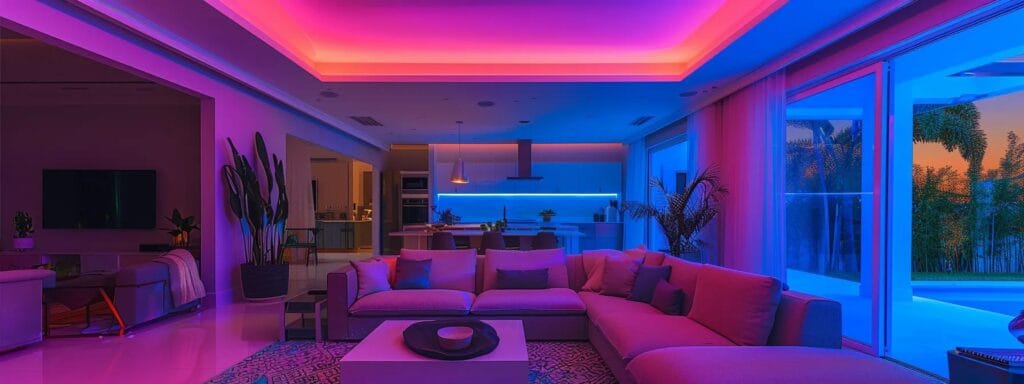
Assess Your Home's Lighting for Color Selection

Correct color selection intimately ties with lighting conditions, both natural and artificial. The amount and quality of lighting in your home can drastically affect how colors are perceived, leading to either a harmonious vibe or a mismatched aesthetic. Sarasota homeowners, known for their love of indoor-outdoor living, must account for fluctuations in natural light throughout the day. The interplay of sunlight, shadow, and artificial light sources demands careful attention when deciding on wall colors, furniture, and decorative accents. Choosing a color under bright sunlight might lead to unexpected variations, so testing samples under different lighting conditions is crucial for accurate decision-making.
Experiment With Natural Light Influences on Wall Colors
Natural light plays a pivotal role in how the chosen color appears across various times of day. In rooms with expansive windows, bright daylight can intensify the vibrancy of bold colors or wash out lighter shades. Homeowners are encouraged to conduct sample tests, painting small sections of walls and observing the color shifts from morning to late afternoon. For instance, a warm beige that appears cozy under diffused morning light may look stark against a midday sun. Documenting these changes ensures an informed choice that remains consistent despite the dynamic lighting of Sarasota’s sunny environment.
Analyze How Artificial Lighting Alters Color Perception
Artificial lighting sources, including recessed lights, chandeliers, and LED strips, each cast different tones that can alter the hue and saturation of paint. The place where artificial and natural lights meet creates a unique challenge that requires specific design strategies. Warm incandescent bulbs may enhance ruby reds and earthy tones, while cool fluorescent lights can bring out the crispness in blues and grays. By evaluating the light’s spectrum and output in different rooms, homeowners can strategically choose a palette that feels comfortable regardless of the prevailing light source. Professional color consultants often suggest using layered lighting techniques to experiment with brightness and shadow, ensuring that the selected colors maintain their intended look in every setting.
Utilize Color Samples to Test Lighting Effects in Rooms
Before finalizing any color decision, it is highly recommended that homeowners use multiple samples on test walls. These samples help in understanding the interaction between paint and lighting. Homeowners can compare swatches under varied conditions by reviewing them in daylight, near windows, and under artificial light. This process not only reduces the risk of an adverse outcome but also allows for small adjustments, ensuring that the final execution enhances the overall charm and mood of the room. Often, color consultants provide a comprehensive kit of samples to streamline this process, helping to avoid expensive repainting or design setbacks.
Choose Hues That Complement Different Lighting Scenarios
In a well-lit home, colors that are too dark might feel oppressive and diminish a room’s natural brightness, while in dimmer areas, lighter hues can help to amplify a sense of openness. The goal is to choose complementary hues tailored to the specific lighting environment of each room. For instance, a dining room with plenty of natural light might accommodate a bold, saturated color, whereas a home office with limited sunlight may benefit from softer, pastel tones combined with vibrant accents on accessories or art to inject life into the space. By carefully curating these choices, homeowners can create a balanced, inviting ambiance that seamlessly adapts to both natural and artificial lighting.
Create a Cohesive Color Palette for Every Room
Creating a cohesive colorpalette is fundamental for maintaining flow throughout your home. When each room speaks in a consistent visual language, the transition from living room to bedroom feels natural and inviting. A well-crafted palette should reflect both the character of the room and the overall design vision. Expert residential painting consultants in Sarasota emphasize the importance of basing your color coordination on tried-and-tested design principles such as the color wheel, which guides the harmonious combination of hues. By mixing soothing neutrals with bold accents, homeowners can balance contrast and continuity to achieve an alluring, sophisticated interior.
Develop a Harmonious Color Scheme That Flows Throughout
A harmonious color scheme serves as the backbone of interior design, uniting disparate spaces through deliberate and thoughtful color choices. The process involves selecting a dominant color, a secondary supportive hue, and one or more accent shades to add liveliness. This technique helps avoid chaotic or disjointed aesthetics that sometimes plague eclectic design attempts. In Sarasota homes where open layouts and indoor-outdoor transitions are prized, a consistent scheme enhances continuity and elevates the overall ambience. For instance, a primary soft gray used throughout can be punctuated with complementary teal or coral accents to provide warmth without overwhelming the visual cohesion. Designers frequently prepare mood boards that juxtapose fabric, paint, and natural elements to ensure that every component embodies a unified narrative.
Mix Soothing and Bold Colors for Dynamic Contrasts
Dynamic contrasts in a room keep the environment exciting and fresh. Homeowners are encouraged to pair calming hues like pale blue or lavender with bolder choices such as deep navy or crisp white, creating a vibrant interplay of colors. This dynamic mix not only highlights architectural features but also stimulates a balanced emotional response. Bold accents in accessories, artwork, or even a single accent wall can serve as focal points, drawing attention to specific areas for both aesthetic and functional purposes. By leveraging both subtle and striking tones, the overall design becomes more inviting, capturing the essence of modern coastal sophistication balanced by understated elegance.
Use Color Wheel Principles to Combine Shades Effectively
The color wheel remains a staple tool for any serious interior designer. By understanding complementary, analogous, and triadic color schemes, homeowners can predict and enhance the interplay of colors within a room. Complementary schemes, derived from opposing colors on the wheel, offer high contrast while maintaining balance, perfect for accent walls and statement furnishings. In contrast, analogous schemes use colors adjacent to each other to create a serene and cohesive look, ideal for bedrooms and quiet spaces. This method not only allows room for experimentation but also provides a scientific approach to achieving aesthetically pleasing results. Utilizing these principles, homeowners can ensure that every color choice contributes to a visually engaging and coherent overall design.
Balance Dark and Light Tones for Visual Appeal
Balance is essential in any design, and when it comes to color, the juxtaposition of dark and light tones can significantly enhance a room’s visual appeal. Dark tones, when used sparingly, provide depth and a sense of drama, while light tones open up spaces and create an inviting atmosphere. Homeowners should aim for a blend that accentuates architectural elements, such as molding or exposed beams, without turning the space into a visual overload. Painting one wall in a darker hue while keeping the remaining walls light can establish a sophisticated focal point that draws the eye upward and outward, expanding the perceived space. This balance, achieved through careful planning and execution, underscores a deep understanding of both color theory and dynamic interior composition.
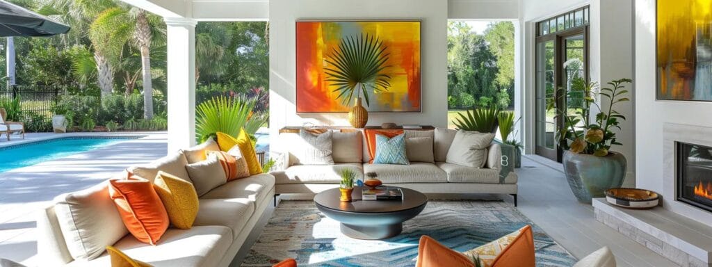
Incorporate Sarasota's Natural Elements Into Your Colors
Sarasota’s vibrant landscape provides an unlimited palette of natural inspiration for homeowners seeking to connect their living spaces to the outdoors. Coastal vibes, historic charm, and lush vegetation all play a part in dictating which colors best reflect the local essence. Incorporating the natural elements around you into your interior design not only increases the cohesiveness between the home and its surroundings but also creates a harmonious, eco-friendly environment that resonates with the region’s energy. The integration of beach-inspired hues, warm earth tones, and sunset-inspired accents forms a strategy that is both aesthetically pleasing and practically enduring.
Use Beach-Inspired Tones to Reflect Coastal Living
With the Gulf Coast as your backdrop, incorporating beach-inspired tones is a surefire way to infuse coastal charm into your home. Soft sandy beiges, ocean blues, and seafoam greens mimic the natural colors found along the shore, creating an interior ambiance that is both serene and uplifting. Such hues are versatile enough to be used in any room—from airy living areas that open to the outdoors to intimate bedrooms that offer a peaceful retreat. Designers often pair these shades with crisp white trim and natural wood accents for an effect that is both timeless and modern. The coastal feel not only resonates with the outdoor landscape but also contributes to a sense of relaxation and rejuvenation, essential for any tropical home setting.
Select Earth Tones That Mirror Local Flora and Fauna
Earth tones extracted from Sarasota’s indigenous plants and soils add organic warmth to a home. Rich terracotta, olive greens, and deep browns can evoke the natural pathways, gardens, and scenic parks that define the area. When combined thoughtfully, these colors ground your interior design in a sense of locality and environmental consciousness. Homeowners can integrate these tones into areas like entryways and living rooms, where they serve to both honor the natural environment and create a welcoming, comforting atmosphere. The varied textures and finishes offered by these colors—ranging from matte painted walls to glossy ceramic tiles—allow for layers of design that are dynamic yet intuitively linked to the region’s landscapeaesthetics.
Find Inspiration From Sarasota’s Sunsets for Color Choices
Few sights are as captivating as a Sarasota sunset, where the sky transforms into a canvas of warm hues. These breathtaking evenings serve as a perfect muse for color consultants looking to bridge indoor and outdoor aesthetics. Shades of orange, blush pink, and rich violet derived from sunsets can be strategically applied as accent colors throughout common areas. These vibrant touches not only evoke the feeling of a lingering summer evening but also provide a visual contrast that enlivens the space. Homeowners are encouraged to experiment with gradient effects that mimic the natural transition of colors seen in the sky, ensuring that the interior environment is both dynamic and responsive to the wonders of nature.
Consider Textures and Finishes That Mimic Natural Surroundings
In addition to color, the texture and finish of surfaces play a significant role in echoing the beauty of Sarasota’s natural environment. For instance, a matte finish can mimic the soft, powdery feel of beach sand, while a semi-gloss finish might reflect the shimmer of sunlight on water. Textural variety in surfaces—from rough plaster walls to smooth, polished wood flooring—adds depth and tactile interest to the space. Homeowners can combine these finishes with carefully selected color palettes to achieve a sophisticated, layered look that integrates both natural and man-made elements. The careful orchestration of texture, finish, and color ultimately builds a home environment that feels organic, balanced, and inviting.
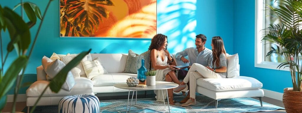
Seek Professional Guidance for Color Consultation
While many homeowners feel empowered to experiment with colors on their own, the expertise of a professional color consultant can be a game-changer—especially for those looking to maximize both aesthetics and property value. Expert consultants bring a refined understanding of color theory, market trends, and regional influences that can transform the way you see your space. In Sarasota, where architectural styles range from mid-century modern to Mediterranean-inspired waterfront estates, specialized consultants can offer tailored advice that not only meets but exceeds your design aspirations. Professional colorconsultation involves a comprehensive process that assesses lighting, materials, and lifestyle needs to propose a palette that ensures harmony and longevity.
Identify Local Color Experts Specializing in Home Design
Finding a local expert who understands the nuances of Sarasota’s home design is critical. These professionals typically have extensive portfolios that showcase successful projects blending coastal influences with modern trends. They are familiar with local suppliers, products, and finishes that perform well under the region’s climatic conditions. By tapping into this local expertise, homeowners gain access to insider tips on effective pairing and trends that aren’t just fashionable but also functionally superior. Local color experts often conduct detailed site visits to assess unique lighting situations and spatial dynamics, ensuring custom-tailored solutions that are a perfect fit for your home’s character.
Learn the Benefits of Hiring a Color Consultant
Working with a color consultant offers measurable advantages, from increasing property appeal and resale value to reducing costly design mistakes. A professional can streamline the decision-making process, saving time and money by eliminating trial-and-error approaches. The consultant’s experience in selecting hues that complement both the architectural style and the homeowner’s personality helps in achieving an enduring look, one that evolves gracefully with emerging trends yet remains timeless. Moreover, the ability of a consultant to foresee how colors interact with varying light sources, textures, and accessories can significantly elevate a design’s overall quality. Homeowners who invest in professional guidance often report higher satisfaction levels and a more cohesive design outcome.
Prepare Questions for Your Color Consultation Appointment
Maximizing the benefits of a professional consultation starts with being well-prepared. Homeowners should compile a comprehensive list of questions addressing everything from paint durability and finish options to recommended color combinations for specific rooms. Common inquiries include how specific color choices can impact the mood of a space or how to balance trendy accents with classic tones. By gathering ideas beforehand and discussing them during the consultation, you ensure a collaborative process that yields personalized, actionable advice. This preparation not only helps in better understanding the consultant’s approach but also creates an opportunity to explore innovative ideas that you might not have considered on your own.
Review Case Studies of Successful Color Consultations
Before finalizing your decision to hire a color consultant, reviewing case studies and testimonials can provide valuable insight. Professionals often document their projects with before-and-after photos, detailed color analysis, and client testimonials. Such case studies illustrate practical examples of how a well-executed consultation can transform a space, overcoming common challenges like poor lighting or mismatched furniture. These success stories can inspire ideas and reassure homeowners of the tangible benefits of expert intervention. Moreover, they serve as a benchmark for quality, allowing residents to assess the consultant’s creative vision and technical skills, ultimately ensuring that you are partnering with a trusted professional who can deliver outstanding results.
| Color Consultant | Specialty | Years of Experience | Notable Projects | Client Satisfaction | Recommended Budget | Service Area |
|---|---|---|---|---|---|---|
| Coastal Designs | Residential | 15+ years | Waterfront Estates, Modern Homes | 98% | $$$ | Sarasota & Surrounding Areas |
| Palette Pros | Interior Design | 12+ years | Historic Renovations, New Builds | 97% | $$$$ | Greater Sarasota |
| Hue Harmony | Color Consultation | 10+ years | Contemporary, Eclectic | 96% | $$ | Coastal Regions |
| Spectrum Experts | Full-Service Design | 20+ years | Luxury Homes, Commercial Projects | 99% | $$$$$ | Statewide |
| Chroma Creations | Residential & Commercial | 8+ years | Boutique Hotels, Upscale Homes | 95% | $$ | Sarasota Metro |
Summary: The table above compares top local colorconsultants, highlighting their specialties, experience, client satisfaction levels, and recommended budgets. This helps homeownerschoose a professional that best fits their designvision and financial plan.
| Design Element | Key Benefit | Color Example | Ideal Room | Mood Effect | Finish Suggestion | Trend Forecast |
|---|---|---|---|---|---|---|
| Lighting | Enhances color depth | Soft white | Living room | Warmth & coziness | Matte | 2025 minimalism |
| Natural hues | Reflects outdoor ambiance | Seafoam green | Bedroom | Calmness & serenity | Satin | Coastal chic |
| Accent colors | Creates focal point | Coral accent | Dining area | Energy & vibrancy | Glossy | Trendy yet timeless |
| Neutral bases | Establishes harmony | Light gray | All rooms | Balance & neutrality | Eggshell | Versatile elegance |
| Texture mix | Adds depth | Terracotta | Entry hallway | Inviting warmth | Matte | Rustic-modern |
| Metallic touches | Imparts luxury | Brass | Kitchen | Sophistication | Semi-gloss | Contemporary vintage |
| Contrasting pairs | Highlights features | Navy & white | Office | Clarity & focus | Flat | Bold minimalism |
Summary: The above table outlines how different designelements contribute to both function and aesthetics. It emphasizes the importance of matching color, finish, and mood to create a harmonious balance in various rooms throughout the home.
| Lighting Factor | Natural Light Impact | Artificial Light Impact | Consideration | Color Adjustment Technique | Example Hue | Best Room |
|---|---|---|---|---|---|---|
| Sunlight intensity | Enhances brightness | Can cause glare | Use muted shades | Test samples at different times | Pale blue | Living Room |
| Window placement | Amplifies color depth | May create shadows | Double-check direction | Adjust with warm accents | Soft beige | Dining Room |
| Bulb type | Warm light softens tones | Cool light sharpens hues | Match bulb to room mood | Use dual lighting strategy | Warm white | Bedroom |
| Room size | Larger spaces offer varied light | Compact spaces evenly lit | Ensure balanced distribution | Complement with darker trims | Light gray | Office |
| Finish type | Matte reduces glare | Glossy reflects light | Coordinate with lighting | Use eggshell finishes | Off-white | Hallway |
| Color intensity | Bright colors true to form | May appear more vivid | Balance with neutrals | Layer colors strategically | Coral | Kitchen |
| Reflective surfaces | Distribute natural light | Can distort color | Use balanced decor | Use textured finishes | Seafoam green | Sunroom |
Summary: The table above details the impact of various lightingfactors on colorperception. It provides practical techniques to adjust and optimize colorchoices based on different lightingscenarios for improved interior aesthetics.
| Color Palette Component | Primary Use | Common Hues | Effect | Suitable for Room | Matching Decor Style | Trend Direction |
|---|---|---|---|---|---|---|
| Dominant Shade | Background | Soft gray, beige | Calming | Living Areas | Modern minimalism | Timeless neutral |
| Secondary Color | Accent layers | Teal, coral | Energizing | Bedrooms, Dining | Coastal chic | Fresh pop accent |
| Tertiary Elements | Decorative | Navy, olive | Bold | Bathrooms, Hallways | Eclectic vintage | Contrasting durability |
| Neutral Balance | Buffer | White, cream | Harmonizes | Kitchens | Scandinavian | Sleek simplicity |
| Warm Undertones | Inviting feel | Terracotta, amber | Cozy | Family Rooms | Rustic modern | Earthy revival |
| Cool Undertones | Refreshing vibe | Mint, icy blue | Refreshing | Offices | Contemporary | Minimalist cool |
| Accent Finishes | Detail highlights | Brass, gold | Luxurious | Entryways | Glam decor | High-end sparkle |
Summary: The comprehensive table contrasts various components of an ideal colorpalette, detailing their usage, common hues, and the overall impact on room ambiance. It further assists homeownersin aligning their designchoices with current trends and decor styles.
Final Thoughts
In summary, understanding and applying color psychology is a transformative approach for Sarasota homeowners looking to elevate their living spaces. By carefully assessing natural and artificial lighting, creating a cohesive palette and incorporating local natural elements, residents can design interiors that are as functional as they are visually appealing. Professional guidance further enhances this process, ensuring that every shade and finish is thoughtfully selected to complement both the lifestyle of the occupants and the regional aesthetic. Ultimately, embracing these colorconsultation tips not only revitalizes your home’s atmosphere but also boosts its market appeal and emotional comfort.
Frequently Asked Questions
Q: How does colorpsychology affect home designin Sarasota? A: Color psychology influences mood and ambiance by evoking specific emotions. Softer hues create calm environments ideal for bedrooms, while bold accent colors energize social areas, aligning with both Sarasota’s coastal vibe and historic charm.
Q: Why are lightingconditions important in selecting paintcolors? A: Lighting—both natural and artificial—affects how colors appear on your walls. Different light sources can enhance or desaturate colors, making it essential to test samples in varying conditions to ensure the chosen palette remains consistent throughout the day.
Q: How can I create a cohesive colorpalettethroughout my home? A: Establish a dominant color for major surfaces, then incorporate complementary secondary and accent colors. This strategy, using color wheel principles, ensures a harmonious flow from room to room while accommodating transition areas such as hallways and open-plan spaces.
Q: What benefits do professional colorconsultants provide? A: Professional consultants offer tailored strategies based on your home’s lighting, architecture, and local trends. They help avoid costly mistakes, provide design inspiration, and create a durable, cohesive interior that meets both aesthetic and resale value goals.
Q: How do I incorporate Sarasota’s natural elements into my interior design? A: Use beach-inspired tones, earth colors, and sunset hues to reflect the natural surroundings. Integrate textures that mimic local materials to create a warm, inviting atmosphere that seamlessly blends indoor and outdoor living.
Comments are closed.