
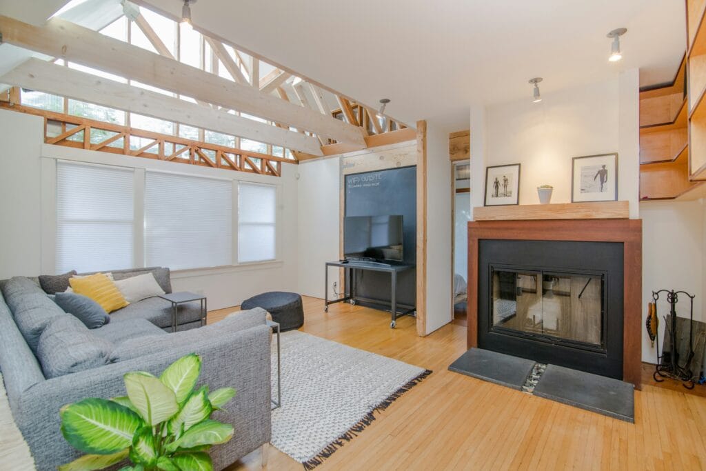
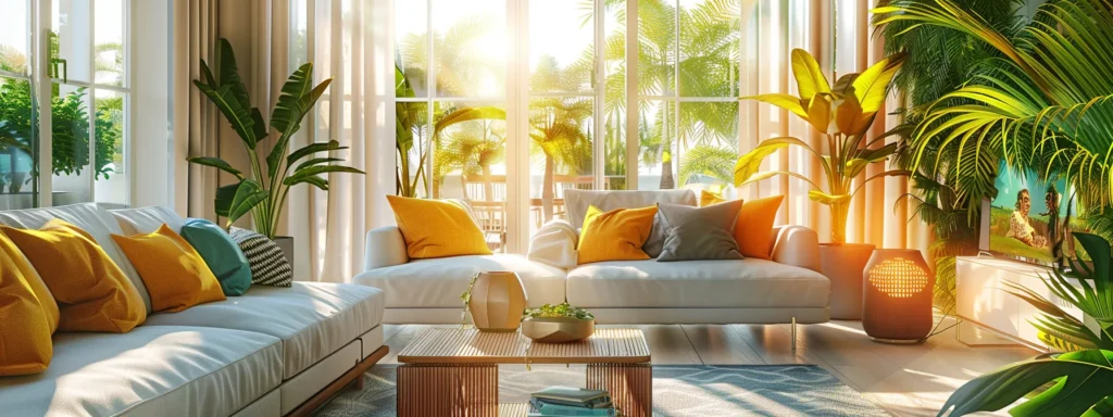
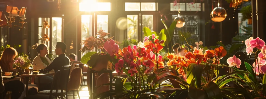
Popular Painting Techniques for Stunning Interiors
Are you looking to transform your home’s interior but unsure where to start? Painting techniques offer a powerful way to elevate your space without a complete renovation. This post explores popular painting techniques, including color washing for a unique finish and sponge painting for added texture. By understanding these methods, you can confidently choose the best style for your home, creating stunning interiors that reflect your personal touch while addressing common design challenges. Let’s dive in and discover how these techniques can enhance your living environment.
Color Washing Techniques for a Unique Finish
Choosing the right color palette is crucial for achieving a stunning effect with color washing. In the next section, I’ll provide a step-by-step guide to help you master this technique, ensuring that you understand how to use bristle and latex brushes effectively. You’ll also learn about essential tools, including plastic sheets for protection and bronze accents to elevate your finish. With these insights, you’ll be ready to transform your interiors. For house painters venice fl, these techniques can significantly enhance your projects.
Choosing the Right Color Palette
When it comes to color washing, selecting the right color palette can significantly enhance the beauty of your space. I recommend starting with a soft base color that sets the tone for the room. From there, you can layer on darker shades or complementary hues to create a beautiful gradient effect. This technique adds depth and character, particularly when applied to cabinetry, making it stand out while still feeling cohesive within the overall design.
Incorporating metallic accents, such as gold leaf, into your color washing can elevate the finish and provide a luxurious touch. It’s essential to apply a sealant after your color wash to protect your surfaces, ensuring your work lasts for years. As you mix and experiment with different shades, use a brush to achieve the desired texture and softness; this will help create the unique finish you envision. Engage in this process, and you’ll discover how a carefully curated color palette can transform your interiors beautifully.
Step-by-Step Guide to Color Washing
To begin the process of color washing, I recommend preparing your walls by applying a suitable primer. This basic layer sets the foundation for your color wash, ensuring that the subsequent colors adhere properly and achieve an even finish. Once the primer has dried, mix a combination of your chosen paint with a putty or joint compound. This will create a workable texture that enhances your color wash application. Using a sponge, apply the mixture to the walls in a gentle, sweeping motion, allowing different shades to blend and create a unique atmosphere within your space.
After applying the base coat with the sponge, I focus on layering darker or complementary colors to develop depth. You can use a clean sponge or a brush to achieve various textures; simply dab or wipe to create the desired effect. Keep in mind that patience is key—allow the layers to dry fully before adding another to prevent muddiness. Completing the process with a sealant will not only protect your newly transformed walls but also maintain the beauty of your color washing for years to come. By following these steps, you can successfully achieve a stunning finish that enhances your interiors and reflects your personal style.
Tools Essential for Color Washing
When embarking on a color washing project, having the right tools is essential for achieving a flawless finish. I always recommend using a quality rubber or foam sponge, as it lends itself well to creating the intended texture. Additionally, don’t forget a clean pencil to outline any areas you want to mask for precision. This is particularly valuable in spaces like the bathroom, where sharp lines can greatly impact the overall interior design and enhance the cohesiveness of the color palette with complementary colors.
Protecting adjacent surfaces is another priority when color washing. I rely on high-quality masking tape for this purpose, as it ensures clean edges and minimizes any unwanted paint splatter. Using a roll of plastic sheeting can provide an extra layer of protection for your floors and furniture, making cleanup easier. By having these tools on hand, I can focus on the creative aspect of the color washing process, knowing that I am well-prepared to bring my artistic vision to life.
Sponge Painting for Texture and Depth
When considering sponge painting, selecting the best sponge is essential for your project. I’ll guide you on techniques that ensure a seamless look on your walls and doors. Additionally, I will share creative ways to incorporate sponge painting, including how to use stencils for intricate designs and protect your carpet. These insights will enhance the beauty of your interiors while maintaining an organized approach.
Selecting the Best Sponge for Your Project
Selecting the right sponge is a fundamental step in achieving the best results with sponge painting. I recommend using natural sea sponges or synthetic sponges designed for painting, as they provide excellent adhesion and texture during application. Before starting, I always vacuum the surface to remove any dust that could hinder the adhesion of the paint, ensuring a smooth foundation for your work.
When working with specific finishes like metallic paint or marbleizing, the choice of sponge becomes even more critical. I often experiment with different sponge shapes to achieve varying effects, such as a soft sponge for subtle tones or a denser one for pronounced texture. Securing the sponge to a screw can help facilitate control during application, allowing for precision in detailing and design.
Techniques for Achieving a Seamless Look
To achieve a seamless look with sponge painting, I find that proper preparation is key. This involves sanding the surface to create a smooth and even foundation, allowing the paint to adhere better. After sanding, I often use a sprayer to apply a base coat; this method helps ensure a uniform color before I begin layering with the sponge technique. By maintaining a consistent angle while applying paint, I can achieve the fluid transitions that define a polished finish.
When working on edges or corners, I incorporate caulk to fill any gaps, which establishes clean lines that enhance the overall appearance. I also choose linen cloths to work alongside my sponges, using them to dab and blend colors seamlessly. By combining these techniques, I can effectively manipulate texture and depth, resulting in stunning interiors that captivate the eye while still feeling inviting and cohesive.
Creative Ways to Incorporate Sponge Painting
One effective way I incorporate sponge painting is around baseboards to create a subtle yet appealing contrast. By choosing a satin finish paired with a soft, blended color, I can enhance the elegance of the room without overwhelming the visual space. The gentle texture provided by the sponge adds depth and uniqueness, making the baseboards a stylish focal point rather than just a functional element.
An additional method I often utilize involves using copper paint to achieve an eye-catching accent on specific sections of the wall. By applying the copper finish with a sponge technique, I create a rich texture that reflects light beautifully, adding a touch of luxury. This simple approach can transform any room, making it feel more inviting and sophisticated, which is often a key concern for homeowners looking to elevate their interiors.
Rag Rolling to Create Soft, Organic Patterns
Preparation is key when it comes to rag rolling, as it sets the stage for exquisite texture and depth. I will share tips on maximizing coverage while maintaining appropriate pressure to achieve a stunning patina. Additionally, I will explore how variations in paint color can create unique effects, ensuring your interiors stand out. Finally, I’ll emphasize the importance of microfiber materials and dust prevention for a flawless finish.
Preparation Tips for Rag Rolling
Before starting rag rolling, it’s essential to prepare the surface to ensure an optimal outcome in your interior painting project. I always begin by cleaning the walls thoroughly, making sure to remove dust and grease that may affect paint adhesion. Using a putty knife, I fill any imperfections or cracks to create a smooth, even landscape. This meticulous preparation sets the stage for a stunning finish, particularly when dealing with light switches or other wall fixtures that could interrupt the flow of your design.
Additionally, I find that applying a primercoat helps to seal the surface and improve color vibrancy when rag rolling. This enables me to achieve the desired effect more efficiently. After the primer dries, I take the time to inspect areas like the deck and edges for any spots that may require extra attention. Ensuring these areas are well-prepared allows me to work confidently, knowing that I can create the soft, organic patterns that enhance the overall beauty of the room.
Techniques to Maximize Coverage and Texture
To maximize coverage and texture when rag rolling, I often opt for high-quality acrylic paint. This type of paint adheres well to various surfaces, including concrete, and allows me to create the soft, organic patterns I desire. I apply the paint generously on my towel, ensuring it is well-saturated, and then roll it across the wall with a consistent, light touch to achieve an even distribution.
Maintaining even pressure while rolling is essential for achieving a smooth finish without any gaps or inconsistencies. If I notice any pest or debris that may affect the outcome, I address those issues before proceeding. For flooring, I make sure to protect the adjacent surfaces with drop cloths to prevent any accidental spills while working. This attention to detail not only improves the final result but also enhances the longevity of the paint job.
Variations in Paint Color for Unique Effects
When working with rag rolling, experimenting with variations in paint color can yield stunning results. I often mix a base coat with a contrasting glaze using a cotton rag or paper towel for application, allowing me to achieve unique textures. For instance, incorporating a silverglaze over a darker base creates an elegant effect that catches the eye and enhances the overall ambiance of the room.
I find that using multiple hues layered through rag rolling can transform standard walls into captivating features. By varying the intensity of the colors, such as a softer cotton white with deeper shades, I can create an organic flow that adds depth to carpentry details like moldings and trim. This approach not only complements the design but also allows for personal expression through color, making every project feel artistically unique.
Ombré Painting to Add Depth and Interest
In this section, I will cover techniques for achieving a smooth gradient in ombré painting, allowing for a seamless blend between colors. I’ll also discuss how to choose effective color combinations to create striking ombré effects that enhance your space. Finally, I’ll highlight the best areas in your home for ombré painting, ensuring that your choices align with your interior design vision.
Additionally, I’ll touch on how mixtures of different paint applications, such as those involving lime or varnish, can add depth while ensuring waterproofing where necessary. With this knowledge, you can confidently transform your interiors using the ombré technique.
Techniques for Achieving a Smooth Gradient
Achieving a smooth gradient in ombré painting begins with proper preparation of the wall surface, especially if you’re working with materials like stucco or masonry. As I prepare, I make sure to use high-quality masking tape to cover edges and protect adjacent areas, creating clean lines that enhance the final look. Once the surface is ready, I blend my chosen colors, starting with a base and gradually introducing lighter or darker shades to create that seamless transition.
While applying the paint, I focus on techniques that help me maintain an even flow. For instance, I often use a brush to apply the paint in overlapping strokes, which allows the colors to mix naturally. If I notice any uneven spots, I address them promptly with a light touch of the brush, refining the gradient until it meets my expectations. This hands-on approach not only yields stunning results but also ensures the durability of the finish, making it a worthy investment for any homeowner looking to enhance their interiors.
Choosing Color Combinations for Ombré Effects
When choosing color combinations for ombré effects, I find that selecting colors that harmonize can create a visually striking look. For a bedroom, I often suggest starting with soft hues that gradually transition into deeper shades, which can add an inviting atmosphere. Utilizing a utility knife, I can ensure that the transition lines between colors are clean and precise, enhancing the overall elegance of the space.
For areas like a tiled countertop, incorporating contrasting colors can deliver a dynamic effect. I might blend a light cream with a rich taupe, allowing the darker shade to flow delicately into the lighter one. This not only elevates the aesthetic but can also harmonize beautifully with existing elements, such as a strié texture in the tiles, creating a cohesive and sophisticated design.
Best Spaces to Use Ombré Painting
In my experience, ombré painting can be particularly stunning in spaces like bedrooms and dining areas, where a sense of calm and elegance is desired. For bedrooms, I often select soft hues that gradually darken as they reach the ceiling or a roof line, creating an inviting atmosphere that enhances relaxation. In dining areas, using ombré techniques can visually tie together wood grain accents with a complementary color scheme, ensuring a cohesive look that draws guests in.
Additionally, ombré painting works wonders in feature walls or accent areas, particularly where plaster might be exposed. This technique can help conceal imperfections while maintaining visual interest. For instance, I find that applying a gradient effect simulating a sunset can dramatically enhance the warmth of a space, fostering a welcoming environment. Utilizing tools like a paint roller allows for quick and even application, saving both time and effort as I create a beautiful, flowing transition between colors.
Wall Stenciling for Custom Designs
It’s essential to start with selecting the right stencil that complements your style, whether you’re working on drywall or applying designs on a ceiling. Next, I will provide a step-by-step guide to applying stencils effectively, ensuring a polished finish. Finally, I will explore how to create custom stencil templates tailored to your space, perfect for adding personal touches to areas like a basement or for use on metal surfaces.
Selecting the Right Stencil for Your Style
Selecting the right stencil for your style begins with understanding the overall aesthetic you wish to achieve in your space. I often guide homeowners by considering the room‘s colors and furnishings, as these elements will inform your choice of designs. Whether you prefer intricate patterns or simpler motifs, assessing how the pigment in the stencil complements existing hues can help you create a harmonious look, enhancing your home improvement project.
Another essential factor is the size and placement of the stencil. I recommend testing various stencils on a smaller wall or using a piece of cardstock to envision how the design will fit into your space. This method allows you to visualize patterns before committing to a paint bucket full of color, ensuring the final result aligns with your vision. Remember to think about your email address if you’re seeking inspiration online, as many platforms provide excellent examples of custom stenciling that could spark ideas for your own faux painting projects.
Step-by-Step Guide to Applying Stencils
To effectively apply stencils, I first ensure that the surface is clean and smooth, which is essential for achieving a crisp finish. I often use spray paint for its even coverage, especially when I want to replicate a fresco or marble effect that adds sophistication to the room. It’s crucial to test the paint on a separate piece to see how it interacts with the stencil design before applying it to your walls.
Next, I carefully position the stencil on the wall, using painter‘s tape to keep it in place and prevent any movement during application. I apply the paint gently, using a sponge or brush to avoid bleed-through that can ruin the design. If you follow these tips, you’ll find that stenciling can be an easy and rewarding way to create custom designs in your house painting projects, ultimately transforming your interiors into something truly stunning.
Creating Your Custom Stencil Templates
Creating custom stencil templates begins with selecting a design that complements the aesthetic of your room or patio. I recommend using materials such as steel or flexible plastic, as they are durable and can withstand repeated use. After choosing the shape, I carefully sketch it out on my chosen material and use sandpaper to smooth any rough edges, ensuring a clean application when I stencil.
Once the template is prepared, I position it on the desired surface and secure it with painter‘s tape to prevent movement during application. This step is particularly important when stenciling in areas like a lawn-facing patio or a decorative wall in your home. By taking the time to create well-crafted stencils, I ensure that the finished design is exactly as envisioned, adding a personal touch to my interior spaces.
Using Stripes for Modern Design Elements
To achieve striking interiors with stripes, I focus on techniques for perfectly straight lines, ensuring crisp and clean transitions. I explore color combinations that work well to achieve a balanced look, alongside creative stripe patterns that can elevate any space. Through innovative methods like gilding with leaf accents, I infuse a touch of elegance into modern renovations.
Techniques for Perfectly Straight Lines
Achieving perfectly straight lines when painting stripes requires careful preparation and the right tools. I recommend starting with high-quality painter‘s tape to outline your stripes. This tape ensures that paint does not bleed underneath, allowing for sharp, clean edges. Additionally, it’s helpful to press the tape down firmly along its edges, as this will create a barrier that maintains the integrity of your paint job, especially when applying contrasting colors like a whitewash finish on deeper shades.
Another useful technique for maintaining straight lines is to use a level or laser guide when marking your stripe locations. This ensures uniformity and takes the guesswork out of positioning. When I paint, I often apply the whitewash technique first, allowing it to dry before carefully adding darker shades to create visual interest. Using a small brush for touch-ups can also enhance the precision of the lines, ensuring your stripes not only look professional but also elevate the overall aesthetic of your interiors.
Color Combinations That Work Well With Stripes
When considering color combinations for stripes, I often recommend pairing timeless neutrals with bold accent colors. For instance, a soft gray paired with a deep navy can create a sophisticated look, ideal for a modern living room. This contrast draws attention to the stripes while allowing the colors to complement each other without overwhelming the space, making it both inviting and stylish.
Another effective approach is to use analogous colors, like various shades of blue transitioning into greens. This method creates a serene, monochromatic feel that enhances the overall sense of harmony in a room. By carefully selecting these color combinations, you achieve a layout that feels cohesive, ensuring your striped designs become a striking focal point that elevates your interiors effortlessly.
Creative Stripe Patterns to Consider
One creative stripe pattern I often recommend is the use of wide and narrow bands alternately. This approach not only adds depth to walls but also creates a rhythm that can enhance the overall flow of a room. By strategically placing these stripes, I can evoke a sense of movement, making a space feel dynamic and inviting, especially in areas like living rooms or corridors.
Another striking option is to incorporate diagonal stripes, which can add a unique twist to traditional designs. I find that diagonal lines draw the eye upward or across the room, which can make ceilings appear higher or encourage a sense of spaciousness. Pairing these bold designs with complementary colors allows me to personalize each space while ensuring it remains stylish and modern.
Incorporating Checkerboard Patterns Into Interiors
Choosing suitable colors is the first vital step in creating captivating checkerboard patterns. I focus on techniques for precise application, ensuring clean lines and a polished look. Additionally, I’ll identify the best areas in your home for these designs, allowing you to make impactful style choices. Together, these insights will guide you toward a stunning interior transformation.
Choosing Suitable Colors for Checkerboard
Choosing the right colors for a checkerboard pattern is essential in ensuring that it complements your overall interior design. I typically recommend starting with a neutral base color, such as a soft beige or gray, which can create a balanced backdrop. From there, I often select a bold accent color like deep navy or emerald green for the alternating squares, allowing the pattern to stand out while still feeling cohesive within the space.
It’s also important to consider the size of the area where you’re applying the checkerboard pattern. For smaller spaces, lighter shades can help to create a sense of openness, while larger rooms may benefit from richer, darker hues that add depth. By thoughtfully selecting colors that either contrast or harmonize with existing furniture and decor, you can elevate the aesthetic of your interiors through this classic painting technique.
Techniques for Precise Checkerboard Application
To achieve a precise checkerboard application, I begin by measuring and marking the dimensions of each square on the wall with a level and pencil. This step is crucial; it ensures that the pattern aligns correctly and maintains visual symmetry throughout the space. After marking, I apply high-quality painter‘s tape along the edges of the squares, pressing it down firmly to prevent any paint bleed-through during the application process.
Once the tape is in place, I select my paint colors, usually starting with a neutral base for the first layer. Applying the first color carefully within the taped squares, I then allow it to dry completely before removing the tape—a key practice that reveals clean lines. I repeat this process with the accent color, ensuring that each square contrasts beautifully with the base color, culminating in a striking checkerboard pattern that enhances the overall appeal of the room.
Best Areas for Checkerboard Patterns
In my experience, checkerboard patterns work exceptionally well in entryways and kitchens. These areas often benefit from bold designs that can create a striking first impression or a lively atmosphere. The contrast in colors can visually expand smaller spaces, making them feel more inviting while adding a touch of sophistication to your home’s overall decor.
Additionally, bathrooms are a fantastic place to incorporate checkerboard patterns. The clean lines and defined shapes can enhance the elegance of the space without overwhelming it. By selecting colors that complement your tiles and fixtures, you can craft a cohesive look that elevates your bathroom’s ambiance and functionality, making it an attractive spot for relaxation.
Harlequin Patterns to Make a Bold Statement
Planning your harlequin design is essential for achieving a striking look that captivates the eye. In this section, I will discuss the specific tools needed for applying harlequin patterns effectively, ensuring clean lines and a polished appearance. Additionally, I’ll explore how to complement harlequin designs with other decor elements, creating a cohesive and inviting atmosphere in your space.
Planning Your Harlequin Design
When planning your harlequin design, I recommend starting with a clear vision of how this bold pattern will integrate into your space. It’s essential to choose colors that not only reflect your personal style but also harmonize with existing furnishings and decor elements. For instance, selecting a light base color paired with a vibrant accent can create a striking contrast that rejuvenates the room without overwhelming it.
Before I apply the harlequin pattern, I always take the time to sketch out a layout to ensure even spacing and alignment of the diamonds. This preparation step is crucial for maintaining a professional appearance, as precise measurements will help me achieve balanced dimensions that enhance the overall aesthetic. Additionally, using high-quality painter‘s tape will keep lines sharp, ensuring that my finished work makes a lasting impression.
Tools to Use for Applying Harlequin Patterns
When I approach the harlequin pattern, having the right tools is essential for achieving clean and precise lines. I find that high-quality painter‘s tape is indispensable; it helps secure the edges of the diamonds and prevents any paint from bleeding underneath. Additionally, a level is crucial for maintaining symmetry as I layout the design, ensuring that each diamond is perfectly aligned for a professional finish.
Alongside painter‘s tape and a level, I often utilize a fine brush for detailing, which allows me to carefully paint the smaller areas without compromising the overall design. For larger sections, a roller can speed up the application process while helping maintain consistency in texture. By having these tools at my disposal, I can confidently create bold harlequin patterns that transform any space into an eye-catching feature, enhancing the overall aesthetic of my interiors.
Complementing Harlequin With Other Decor
When incorporating harlequin patterns into a space, it’s essential to choose decor elements that enhance the boldness of the design without overwhelming it. I often suggest pairing the striking diamond pattern with solid or subtly patterned textiles, such as throw pillows or curtains, to create balance. For instance, a neutral fabric can ground the vibrant colors of the harlequin design, allowing it to remain the focal point while supporting the overall aesthetic of the room.
In addition, I find that accessories play a crucial role in complementing harlequin patterns. Using items such as sculptural vases, art pieces, or furniture with clean lines can add sophistication and cohesiveness to your decor. Choosing these elements carefully will invite a sense of unity in the space, demonstrating that a bold statement can harmonize beautifully with thoughtfully selected accessories, creating an inviting and well-designed environment.
Polka Dots for Playful Spaces
Incorporating polka dots into your interior design can create a playful and inviting atmosphere. I’ll cover the best rooms for polka dot inspiration, helping you identify where this fun pattern can shine. I’ll also share methods for achieving perfectly placed polka dots to enhance your walls and furnishings while discussing how to balance polka dots with other patterns for a cohesive look.
Best Rooms for Polka Dot Inspiration
In my experience, polka dots can truly transform spaces like nurseries and playrooms, adding a lighthearted touch that makes them feel welcoming. I often choose soft pastel colors for a gentle ambiance, or bold primary hues for a more energetic vibe, depending on the overall design scheme. This approach not only beautifies the environment but also stimulates a child’s imagination, creating a playful atmosphere where creativity flourishes.
Additionally, I find that incorporating polka dots in casual dining areas or breakfast nooks can bring warmth and character to these spaces. By using a combination of coordinating accessories, such as tableware or decorative pillows with polka dot patterns, I can create a cohesive look that enhances the room‘s charm. This method helps to bridge the gap between functionality and aesthetics, ensuring that the space remains inviting while still serving its intended purpose.
Methods for Perfectly Placed Polka Dots
To achieve perfectly placed polka dots, I focus on careful measurement and planning. Before starting, I mark the desired positions on the wall using a light pencil, ensuring even spacing that creates a professional look. This simple step allows me to visualize the pattern and adjust as needed to maintain symmetry and balance throughout the space.
When it comes to applying the dots, I prefer using high-quality stencils or painter’s tape to define the edges, which prevents paint bleed and delivers crisp results. I recommend practicing on a piece of cardboard first to refine my technique. This preparation helps me ensure that the final application will be smooth and visually appealing, making the polka dots a charming feature in any playful space.
Balancing Polka Dots With Other Patterns
When incorporating polka dots into your interiors, I find it essential to balance them with other patterns to create a cohesive look. For example, pairing polka dots with subtle stripes or chevron patterns can add visual interest without overwhelming the space. This combination allows the playful nature of the dots to shine while maintaining an organized aesthetic that appeals to both children and adults.
I often recommend using solid colors or muted patterns as backgrounds when integrating polka dots with other designs. This strategy helps to ground the playful element of the dots, making them a fun feature rather than the sole focus. By choosing coordinating colors and varying the scale of the patterns, I can achieve a harmonious blend that engages the eye and invites exploration, enhancing the overall design of the space.
Incorporating Metallic Finishes for a Luxe Look
Choosing the right metallic paints is the first step to achieving a luxe look in your interiors. I’ll cover techniques for flawless metallic application, ensuring a smooth finish that enhances any space. Additionally, I’ll explore how to pair metallics with other painting techniques, allowing you to create stunning visual effects that seamlessly elevate your home’s style.
Choosing the Right Metallic Paints
When selecting metallic paints for your interiors, I focus on the quality and finish that will best suit the space I’m working on. For instance, I often recommend using high-quality metallic paints that come in a range of finishes, such as satin, gloss, or matte, depending on the desired effect. Understanding how the sheen interacts with light can help create the luxe, elegant look I want for my clients’ homes.
Another key aspect is considering the color palette of the room. I find that metallics like gold, silver, or copper can enhance certain design elements when paired correctly. For example, using a rich gold on an accent wall can create a striking focal point, especially when combined with neutral tones. Testing small samples in the actual space can provide valuable insight into how the colors will work together, ensuring a cohesive and attractive outcome.
Techniques for a Flawless Metallic Application
For a flawless metallic application, I always prioritize proper surface preparation. This includes cleaning the walls to remove dust and grease, followed by sanding to achieve an even texture. A smooth surface allows the metallic paint to adhere better, resulting in a refined finish that enhances the overall look of the space.
When applying metallic paint, I recommend using high-quality brushes or rollers specifically designed for smooth finishes. I often opt for a foam roller, as it minimizes brush strokes and maintains an even coat. Working in sections and applying multiple thin layers instead of one thick layer helps avoid drips while achieving that lustrous sheen everyone desires. This method ensures the longevity and beauty of the metallic finish in your interiors.
Pairing Metallics With Other Painting Techniques
Pairing metallic finishes with other painting techniques can create a rich, layered look for your interiors. I often combine metallics with techniques like sponge painting or color washing, which allows me to achieve depth and dimension in a space. For instance, applying a subtle metallic glaze over a soft color wash can enhance the overall ambiance, drawing attention to features like cabinetry or accent walls while maintaining a cohesive design.
Another effective method I use is to blend metallic paints with textured applications, such as rag rolling or stenciling. By incorporating a metallic accent into a textured background, I can elevate the intricacy of the design, resulting in an elegant finish that catches the light beautifully. This approach not only adds sophistication but also personalizes the space, creating a unique atmosphere that resonates with homeowners looking to make a memorable impact in their interiors.
Cost Considerations for DIY Painting Techniques
Budgeting for materials and supplies is crucial when undertaking DIY painting techniques, as it ensures I have everything needed to achieve the desired look. I also weigh the costs of hiring professionals against the potential savings of a DIY approach. Additionally, I’ll calculate the value of each painting technique to ensure my investment leads to stunning interiors that reflect my vision.
Budgeting for Materials and Supplies
When embarking on a DIY painting project, budgeting for materials and supplies is essential to ensure a successful outcome. I always recommend that homeowners start by creating a clear list of the necessary items, such as paint, brushes, rollers, primer, and any protective gear, to avoid unexpected expenses while retaining focus on popular painting techniques. This strategic approach helps in estimating the overall cost, allowing for adjustments if you need to choose quality over quantity for a more sustainable finish.
Another vital aspect to consider is the balance between saving money and investing in quality materials. While it may be tempting to opt for the least expensive options, using higher-quality paints and tools often leads to better results and a longer-lasting finish. Drawing from my experience, I find that investing in quality paint can enhance the final look and minimize the need for frequent touch-ups, making your interior transformations both stunning and cost-effective in the long run.
Evaluating the Cost of Hiring Professionals
When evaluating the cost of hiring professionals for painting projects, I find it’s essential to consider not just the upfront expenses, but also the long-term investment involved. Professionals bring expertise and experience, which can lead to a higher quality finish and reduced time compared to a DIY approach. In many cases, this means fewer mistakes and touch-ups later, ultimately saving you money in the long run.
Additionally, I understand that hiring a painting company may feel like a significant investment; however, the value often outweighs those initial costs. Professionals have access to high-quality materials and tools that ensure a stunning result, distinguishing their work from DIY attempts. By opting for professional services, you are often choosing peace of mind, knowing that the project will be handled efficiently and professionally, allowing you to focus on enjoying your newly transformed space.
Calculating the Value of Painting Techniques
When calculating the value of popular painting techniques, I emphasize the long-term benefits over initial costs. For instance, investing in high-quality materials for techniques like color washing or ombré painting ensures that your interior transforms last longer and maintain their aesthetic appeal. This not only reduces the frequency of touch-ups but also enhances the overall beauty of your spaces, delivering a significant return on investment.
It’s essential to weigh the time spent on DIY projects against the potential results achieved through professional help. For example, while I enjoy painting myself, I recognize that hiring a skilled team can expedite the process and provide a flawless finish, ultimately saving both time and money in the long run. By making informed choices about painting techniques, I guide homeowners to not only beautify their interiors but also wisely utilize their resources for lasting impact.
Benefits of DIY Painting vs. Professional Help
To achieve stunning interiors, it’s essential to understand the skills needed for successful DIY painting projects. I will cover common mistakes to avoid, ensuring your efforts yield a polished finish. Additionally, I’ll discuss when it’s best to hire a professional painter, guiding you on how to make informed decisions that enhance the beauty of your home.
Skills Needed for Successful DIY Projects
Successfully tackling DIY painting projects requires a blend of essential skills, including preparation, attention to detail, and an understanding of various application techniques. I’ve found that thoroughly prepping your surfaces—cleaning, sanding, and priming—sets a solid foundation for your finish. Taking the time to learn techniques such as color washing or sponge painting can significantly enhance your results, ensuring your walls stand out beautifully.
In addition to technical skill, having patience and the ability to troubleshoot are crucial when it comes to DIY painting. For example, if I notice uneven coverage, I always take a step back, reassess the situation, and make adjustments rather than rushing through the task. This dedication to quality not only improves the aesthetics of my home but also fortifies my confidence in handling future projects, making DIY a rewarding experience for anyone willing to invest the effort.
Common Mistakes to Avoid in DIY Painting
One common mistake I often see in DIY painting projects is insufficient surface preparation. It’s vital to clean the walls thoroughly, remove any dust or grease, and properly fill in any cracks or imperfections before applying primer. Neglecting this step can result in uneven finishes, peeling paint, or areas where the color doesn’t adhere properly, significantly affecting the overall aesthetic of your interiors.
Another frequent error is rushing through the drying process between coats. I’ve learned the importance of allowing each layer to dry completely before adding another, as this helps prevent color muddiness and ensures a smoother finish. By being patient and taking the time to layer the paint correctly, you can achieve a professional look that embodies the stunning interiors you envision without the hassle of constant touch-ups down the line.
When to Hire a Professional Painter
When considering whether to hire a professional painter, I recommend evaluating the scale and complexity of your project. For intricate techniques like ombré painting or detailed stenciling, the expertise of a professional can help ensure that the results are flawless. Their familiarity with various applications and tools can prevent common mistakes that might arise during DIY projects, ultimately saving you time and frustration.
Additionally, if you’re dealing with large spaces or require extensive surface preparation, enlisting a professional can be a smart choice. Professionals bring a level of efficiency and access to high-quality materials that may not be available to the average homeowner. This investment often pays off in the long run, as it leads to a polished finish and longevity of your interior paint jobs, allowing you to enjoy your stunning interiors without the worry of frequent touch-ups.
Resources for Further Learning and Inspiration
As I continue to explore popular painting techniques, I’m excited to share some valuable resources for those looking to enhance their skills. You’ll find top blogs and websites dedicated to painting techniques that provide practical insights and inspiration. I also recommend specific books for aspiring painters that dive deeper into various methods. Additionally, online communities are perfect for sharing experiences and ideas, fostering a supportive environment for creativity.
Top Blogs and Websites on Painting Techniques
When looking to expand your knowledge on popular painting techniques, I often recommend exploring reputable blogs and websites dedicated to interior painting. These resources not only provide detailed guides on methods like color washing and sponge painting but also feature practical advice that can help elevate your projects. One site I frequently refer to is The Paint Quality Institute, which offers insights into the science of paint and application methods, ensuring you achieve a flawless finish in your interiors.
Another excellent resource is Houzz, where I find a wealth of inspiration and examples of stunning interior paint projects. The community aspect of Houzz allows for sharing experiences and ideas, fostering a collaborative environment for creative exploration. By engaging with these platforms, I continually refine my techniques and discover new approaches to painting, helping homeowners transform their spaces beautifully.
Recommended Books for Aspiring Painters
One book I often recommend for aspiring painters is “The Complete Book of Painting Techniques” by John A. M. Graham. This resource covers a wide range of popular painting techniques, including color washing and sponge painting, providing detailed instructions and practical examples. I appreciate how it breaks down each method step-by-step, making it accessible for those looking to enhance their home interiors through painting.
Another excellent read is “Decorative Painting: The Complete Guide to Painting Techniques” by Rachael B. Alton. This book dives deeper into innovative techniques like rag rolling and ombré painting, which can transform a space dramatically. It’s been invaluable to me as it offers real-life applications and insights, helping you confidently explore your creative side while improving your painting skills.
Online Communities to Share Experiences and Ideas
Online communities provide an excellent platform for sharing experiences and ideas related to popular painting techniques. I often participate in groups dedicated to home improvement and interior design on social media, where members exchange tips, before-and-after photos, and inspiration that genuinely enhances our projects. Engaging in these communities not only enriches my knowledge but allows me to connect with fellow enthusiasts who share similar goals for transforming interiors.
In these forums, I find it valuable to ask questions and seek advice on techniques I’m looking to master, such as color washing or rag rolling. Many members are eager to share their firsthand experiences, offering practical insights that can save both time and effort in my projects. By being part of these collaborative spaces, I continually learn how to achieve stunning finishes while building a supportive network that inspires creativity and innovation in my painting endeavors.
Transform Your Home with Stunning Painting Techniques: Final Thoughts
Mastering popular painting techniques is essential for transforming interiors into visually stunning spaces. Techniques such as color washing, sponge painting, and ombré effects not only enhance a room‘s aesthetic but also reflect personal style and creativity. By selecting the right colors and tools, and taking the time to prepare surfaces, homeowners can achieve professional-quality results that stand the test of time. Embrace these methods to elevate your home, ensuring a living environment that is both inviting and uniquely yours.