
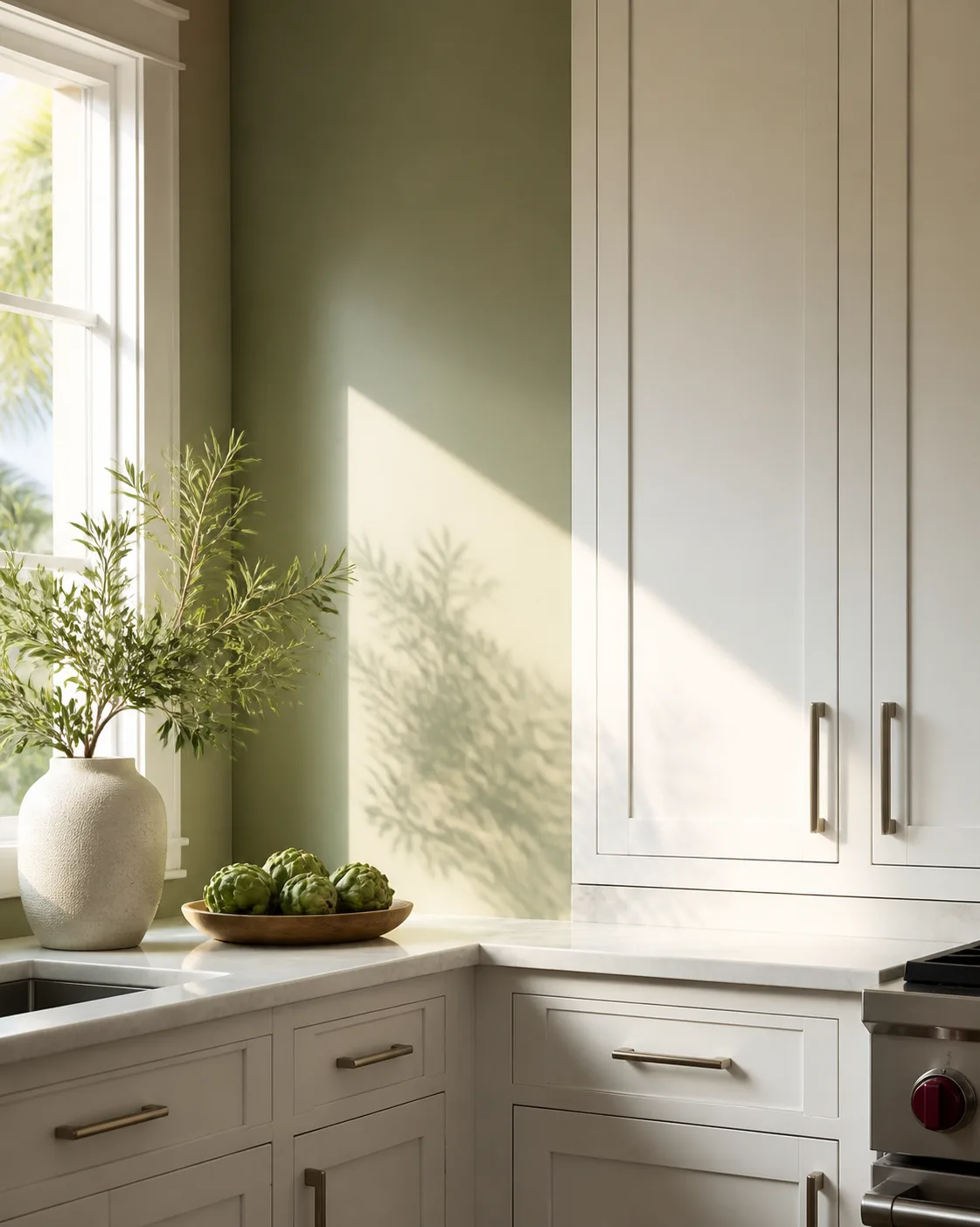
Planning sage green kitchen walls with white cabinets starts with one question: do your cabinets read crisp, creamy, or somewhere between? That answer helps you choose a wall tone that feels intentional instead of slightly off. Before you settle on a shade, compare full-size sample boards in your actual light. If you want help with the kitchen as a whole, our interior painting team can plan the relationship among the wall, trim, and cabinets.
The combination can feel calming and welcoming because it gives the eye both personality and breathing space. Yet no single green works in every kitchen.
Flooring, counters, tile, hardware, and window direction all change the result. Use this guide to build a classic design around the finishes already in your home, then test the final choice before coating goes on the wall.
Start With Your Cabinet White
White is not one fixed tone. Some doors appear crisp and cool. Some have a creamy warmth. Older finishes may have softened over time. Place a plain sheet of white paper against a door if you need a quick reference, then study the pairing in morning and evening light.
A cooler cabinet white pairs with a muted green that has a cleaner gray cast. Warm cabinetry often feels more comfortable beside a soft sage with a touch of warmth. If the two undertones fight, the cabinets may appear yellow or the wall may appear dull. If they sit together well, the contrast feels clear but not severe.
Do not choose from a tiny chip alone. Grove Street Painting uses full-size sample boards so you can move each option around the kitchen and see it beside the upper and lower cabinets, counters, and trim. The goal is not to find a perfect option in a store. It is to find the right sage green in your space.
Decide How Much Contrast You Want
The amount of difference sets the mood of the kitchen design. A light sage green wall beside crisp doors creates an airy backdrop. A medium tone brings more character and makes white doors stand out. A deeper green adds drama, but it needs enough open space and good light to keep the kitchen from feeling too cozy.
Think in three levels:
- Low contrast: Choose a pale, muted option for a breezy and simple look.
- Medium contrast: Use a recognizable sage for a balanced, timeless style.
- High contrast: Try a deeper tone when you want the cabinetry to become the brightest element in the room.
A medium difference is a useful starting point for many ideas because it leaves space for stone, wood, brass, and tile to contribute without making the palette busy. It also gives you flexibility if the kitchen opens into a living area. The result can feel timeless without becoming formal.
Build Around the Countertops
Countertops cover a large visual plane, so treat them as part of the palette rather than a later detail. A white or lightly veined surface keeps the kitchen fresh and lets the wall carry more personality. Warm gray counters may bridge cool doors and an earthier wall. Butcher block adds natural texture and a rustic note.
Black counters create a stronger break. That may appear elegant in a large, bright kitchen, but it may feel heavy in a smaller space. If your counters already contain several tones, select one quiet undertone to repeat instead of trying to match every fleck.
Set a sample board directly behind the counter. Then step back to the doorway. A sample that appears beautiful from six inches away may feel very different when the counters, door, floor, and wall enter the same view.
Use the Backsplash as a Bridge
A backsplash sits between the counters and upper cabinets, which makes it a natural bridge in a green and white palette. White subway tile keeps the arrangement clean and classic. A handmade surface may add texture and vintage charm. Marble-look material may connect pale counters with a muted wall.
Grout matters too. A dark grout line creates a busier pattern, while a close tone gives the backsplash a quieter role. If the surface already has movement, make the wall treatment simple. If it is plain, the wall may carry more personality.
Do not force all three surfaces to match. The more useful goal is rhythm: one surface leads, one supports, and one gives the eye a place to rest.
Add Warmth With Hardware and Fixtures
Hardware offers an easy way to tune the final design. Brass hardware brings warmth and makes a cool palette feel more welcoming. Black handles create a crisp break and suit a modern kitchen. Nickel is quieter, especially when the sink and appliances already use a silver finish.
For a classic farmhouse direction, pair a farmhouse sink with cup pulls and restrained brass accents. One brass faucet or two brass fixtures may be enough. Repeating brass on every available surface may overpower the calm backdrop you worked to create.
The shape matters as much as the finish. Simple bar pulls support a modern style. Cup pulls and latches add vintage character. Match the scale to the doors, especially on wide drawers and lower cabinets.
Plan the Island and Lower Cabinets
You do not have to put all the sage green on the walls. A two-tone kitchen may use white uppers for an open feel and a deeper shade on the island or base cabinets. This approach adds visual weight near the floor while keeping the upper half of the room light.
If your walls carry sage green, matching the island to the white kitchen cabinets gives the room one clear color story. If you want the island to become a focal point, choose wood, charcoal, or a related darker green. Keep the lower cabinets and island coordinated unless you have a specific reason to separate them.
Avoid adding a new hue just because one surface remains undecided. A smaller palette usually gives the kitchen more room to breathe.
Check Samples in Real Light
Morning light, afternoon sun, a pendant, and under-cabinet lighting may each change how a wall appears. Move the sample board from the window wall to a shadowed corner, then check it again after dark. View it beside the door face, counter edge, and flooring.
A good test answers practical questions:
- Does the wall still look balanced when the lights are on?
- Does the cabinet white stay clean beside it?
- Does the space feel open from the main doorway?
- Does the color work with the adjoining living space?
Grove Street Painting brings full-size sample boards into the homeowner's actual light. That process helps you compare sage green options before the crew begins prep, rather than making the selection from a fan deck alone.
Connect an Open Floor Plan
An open kitchen should relate to the next room without copying it. If the adjoining area is neutral, repeat a small amount of the kitchen color through art, fabric, or a plant. If the living room already has green, vary the depth so the home does not feel like one long painted space.
The sage living room guide shows ways to carry the family of color into a connected space. For a bedroom, use a quieter balance and softer separation. Our sage bedroom ideas cover that more restful direction.
Flooring provides the common thread. Natural wood connects both spaces. Pale stone keeps the plan airy. Dark flooring calls for a careful balance of light walls, white cabinetry, and open sight lines.
Choose a Finish for Daily Kitchen Use
The wall tone gets most of the focus, but finish affects the final result. Painted surfaces need to suit the way you cook, clean, and live. Talk through the condition of the existing surface, the amount of light, and the areas that receive regular contact before choosing a product and sheen.
The preparation plan matters as much as the finish. Ask how the scope addresses grease, residue, dents, and old repairs before a new coating goes on. Grove Street Painting crews are background-checked and trained on PCA preparation standards. During the project, the Home Protection Ritual includes daily cleanup so the project area is reset rather than left as a mess at the end of the day.
Sage green works best as part of a room, not as a label placed on every object. You do not need green dishes, matching towels, stools, and art to prove the theme. Let sage green provide the main note, then use natural wood, stone, woven texture, or a small touch of metal to support it.
A few choices help the design stay grounded:
- Use one sage family, not several unrelated versions.
- Repeat a hardware finish two or three times.
- Leave some surfaces quiet.
- Mix clean lines with one rustic or vintage detail.
- Make permanent finishes calmer than items you can change easily.
This is also where a little fun belongs. A pendant, runner, or piece of art can bring personality without locking the whole kitchen into one look.
Common Pairing Mistakes
The first mistake is choosing the wall tone before identifying the cabinet undertone. The second is judging a sample in only one spot. The third is layering too many competing finishes after the main palette is set.
Watch for these warning signs:
- The cabinetry looks yellow only when the wall sample is beside it.
- The sage turns flat in one corner and overly bright near another window.
- The backsplash, counters, and wall all compete for attention.
- Brass, black, nickel, and bronze appear with no repeated pattern.
- The island introduces a fourth major hue without connecting to another surface.
If the room feels unsettled, remove one idea before you add another. A clear design often comes from editing.
What the Painting Process Looks Like
A good palette plan should lead into a clear work plan. Desmond Landry personally walks the property before Grove Street Painting prepares a quote. The written proposal is line-itemed, and the estimate price is the final price. If the team misses something after work starts, you are not charged for that mistake.
Before painting begins, the crew protects the room and completes the required surface preparation. The daily reset keeps tools and materials organized while the project is active. At the end, the coating system determines whether the written workmanship warranty is 5 or 10 years. The term is documented for the system used, not offered as one blanket promise for every project.
That process gives you a practical path from sample board to finished room without asking you to make every decision at once.
Start with the fixed elements: cabinetry, counters, floor, tile, and available light. Choose the amount of difference you prefer. Narrow the sage green options to two or three. Then compare full-size boards around the kitchen before selecting the final option.
After that, make the smaller decisions in order:
- Wall and cabinets: Confirm the relationship.
- Island: Decide whether it matches or contrasts.
- Hardware: Select the finish.
- Check the palette under every light source.
- Choose the coating system and finish with your painter.
This sequence keeps a beautiful idea from becoming a pile of unrelated samples. It also makes the quote and production plan easier to discuss because the major design choices are already visible.
FAQ
Will this combination make a small room feel smaller?
It depends on contrast, available light, and the other finishes. A pale sage green wall with white cabinetry keeps the look open, while a darker shade creates more visual weight. Test the color on more than one wall and view it from the doorway before deciding.
Should the island match the perimeter?
Either can work. A white island keeps the wall as the main color. A related green island creates a stronger focal point. Wood or charcoal also works when that finish repeats elsewhere. Choose one clear role for the island instead of asking it to introduce an unrelated theme.
Which metal finish fits this palette?
Brass adds warmth, black creates a crisp break, and nickel stays quiet. Match the finish to your faucet, lighting, and appliances, then repeat it enough to make the decision look deliberate.
How should I test a wall color?
Use a large movable board and compare it beside the cabinets, counter, backsplash, and floor. Check it during the day and after the ceiling lights come on. Grove Street Painting provides full-size sample boards for this part of the planning process.
Ready to Compare Samples in Your Space?
Bring together your cabinet white, counters, tile, flooring, and lighting before you commit to the wall. If you would like a painter to help you test the options and plan the work, request a walkthrough with Grove Street Painting. You will receive a written, line-item proposal with the price-lock terms stated clearly.
See Paint Colors on Your Actual Walls
Stop guessing which colors will look best. Upload a photo of your room and preview 80+ premium paint colors instantly - it's free and takes 30 seconds.